
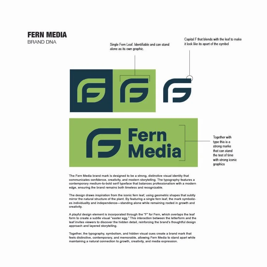
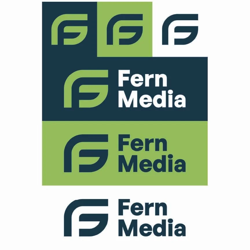
I developed the identity system for Fern Media by combining the organic shape of a fern leaf with a custom “F” icon to create a clean, modern, and recognizable brand mark. The use of vibrant green symbolized growth, creativity, and forward movement, while the geometric typography and simplified icon system gave the brand a strong visual identity that could scale across digital, print, and media platforms.